Задание 2 - Рисунок CSS
Исходное изображение(вариант 4):
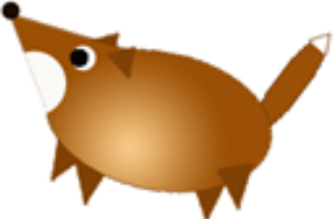
Реализация в CSS:
Исходный код HTML:
<div id="canv">
  <div id="tail"></div>
  <div class="leg"></div>
  <div class="leg" id="leg-fl"></div>
  <div class="leg" id="leg-br"></div>
  <div class="leg" id="leg-br"></div>
  <div class="ear" id="right-ear"></div>
  <div id="snout"></div>
  <div id="body"></div>
  <div id="half-circle"></div>
  <div id="nose"></div>
  <div id="eye"></div>
  <div id="eye-inner"></div>
  <div class="ear"></div>
  <div class="leg" id="leg-lr"></div>
  <div id="tail-tip"></div>
</div>
Исходный код CSS:
#canv {
  width: 200px;
  height: 200px;
  background: grey;
  position: relative;
}

#canv div {
  position: absolute;
}

#nose {
  background: black;
  top: 0;
  left: 0;
  width: 12px;
  height: 12px;
  border-radius: 50%;
}

#snout {
  width: 0;
  height: 0;
  transform: rotate(43deg);
  top: -2px;
  left: -4px;
  border-top: 34px solid transparent;
  border-bottom: 34px solid transparent;
  border-right: 70px solid #a35e17;
}

#eye {
  background: white;
  width: 15px;
  height: 15px;
  left: 42px;
  top: 27px;
  border-radius: 50%;
}

#eye-inner {
  background: black;
  width: 11px;
  height: 11px;
  left: 41px;
  top: 29px;
  border-radius: 50%;
}

#canv > #body {
  width: 126px;
  height: 58px;
  border-radius: 50%;
  left: 27px;
  top: 31px;
  transform: rotate(11deg);
  background: radial-gradient(ellipse at 45% 70%, #f5c98a, #ac661d, #8d4700);
}

#half-circle {
  width: 36px;
  height: 17px;
  border-radius: 100px 100px 0 0;
  transform: rotate(69deg);
  left: 11px;
  top: 38px;
  background: white;
}

.ear {
  width: 0;
  height: 0;
  transform: rotate(137deg);
  top: 23px;
  left: 69px;
  border-top: 10px solid transparent;
  border-bottom: 10px solid transparent;
  border-right: 16px solid #804106;
}

#right-ear {
  top: 16px;
  left: 57px;
}

.leg {
  width: 0;
  height: 0;
  transform: rotate(280deg);
  top: 98px;
  left: 40px;
  border-top: 11px solid transparent;
  border-bottom: 11px solid transparent;
  border-right: 26px solid #804105;
}

#leg-fl {
  transform: rotate(300deg);
  top: 86px;
  left: 25px;
}

#leg-br {
  transform: rotate(273deg);
  top: 109px;
  left: 112px;
}

#leg-lr {
  transform: rotate(264deg);
  top: 103px;
  left: 129px;
}

#tail {
  width: 78px;
  height: 16px;
  border-radius: 50%;
  left: 133px;
  top: 45px;
  transform: rotate(-52deg);
  background: #9c560e;
}

#tail-tip {
  width: 0;
  height: 0;
  transform: rotate(130deg);
  top: 19px;
  left: 188px;
  border-top: 6px solid transparent;
  border-bottom: 6px solid transparent;
  border-right: 12px solid white;
}